Friday, 25 April 2014
Saturday, 12 April 2014
Sunday, 6 April 2014
Saturday, 5 April 2014
Friday, 28 March 2014
Monday, 24 March 2014
Monday, 17 March 2014
Sunday, 16 March 2014
Image manipulation
Monday, 10 March 2014
Digi-Pak Process
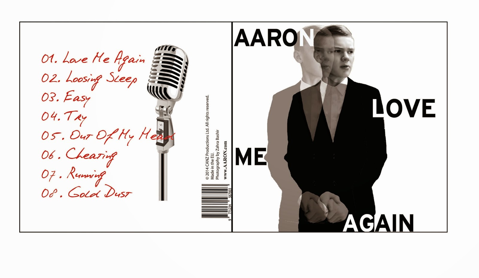
I am in the process of creating the album/single front cover. I want to keep it clean and sophisticated with two main colours. This is because of the star image we are trying to create which is a smooth but sexy artist. I like the first one because of the black and red, I will incorporate more red withing the booklet. i think I will use the second covers for the booklet to show behind the scenes.
Website Research
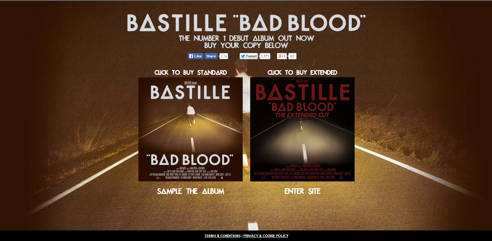
BASTILLE WEBSITE
When you enter Bastille's website before you are taken to the main space you are given the option to sample their new deluxe album and are also shown the track list and the links to buy it. You also see under there recognisable logo that they are recent winners of a brit award. This is different from other websites as the external links are usually their new videos. This is a good technique to use as it makes people fully aware of their new album before entering the real website. And the enter button is at the very bottom of the page which ensures you see what is on the page.
When you enter the website the page is full screen with changing images that are from the booklet and their logo center of the screen. The font of the different links are the same as the logo, showing consistency.
The links are clear as they are directly where the eye would go. They have also included various social media links showing that they work across many platforms to help promote themselves, for example if you click on news it redirects to facebook. Next to the links are the social media buttons. You are able to listen to their previous EPs for free, many artists do this as a way of promotion as it draws more fans in to be able to see their development in music.
They have a link to view their album booklet which I have not seen on any other artists website before. By allowing fans to sample the album and see the digipak that comes with it will attract more fans as it suggests they care more about the music than the money.
THE 1975 WEBSITE
Again before you are able to enter the website a link comes up for you to buy their album, they have various ways you can buy the album which will attract a wider audience.
The logo of the band is the dominant item on the website, this is done so that they are identifiable. Again the tabs and links to social media are clear. The website is a tumblr which has been done due to their target audience which are teenagers, and tumblr is known as a current and modern platform. They have all the latest news eg new images, songs, remixes and tour info.
There is a reoccurring theme of black and white which is what the band is known for. This is done to create a brand identity that is identifiable and recognisable to the audience.
From research of websites I know that making the artists logo visible at all times is important in creating an identity, also to keep the font the same throughout to make them recognizable. The colour should also coincide with the album cover to keep everything consistent. It is important to have more than one link to another social media site to gain more followers.
Thursday, 20 February 2014
Audience
As our genre is 'Pop' we believe we have a large audience, as pop is consumed by the majority of the public. Our target audience ranges, but we are aiming our video at 15-25 year olds. People who listen more to radio stations like Capital FM, are who we are targetting. Not so much Radio 1, because although they do play a lot of pop they also play a lot of rock/indie, I would say more daytime Radio 1. Pop is often heard in many places, this is the kind of song that would be played in shops, and especially clubs!
We will target teenage girls as a primary audience as our artist is a male so would probably have a fandom consisting of teenage girls who often become obsessed with male stars.
We will target teenage girls as a primary audience as our artist is a male so would probably have a fandom consisting of teenage girls who often become obsessed with male stars.
Thursday, 13 February 2014
Editing
Today we looked at the footage we filmed the previous day. We don't think our footage is strong enough as there are more camera shots and angles that can be incorporated, so next time we film we know exactly what to do. However, the lighting and the smoke machine worked well so we will keep them in. Today we also re drew our stroyboard as we believe that some of the ideas we came up with will not work, for example using the children (due to finding time of when to use them).
Wednesday, 12 February 2014
Inspiration
The lighting in this video gave me lots of ideas for our music video. I liked how at the beginning of the video the camera focuses on the light and then travels down to the artist, this will be effective in our video as we are using a dark room with lights and smoke to put all the focus on the artist.
Planning
Today we decided change our idea again because we did not like our idea as it wasn't really working and also due to scheduling with people. We changed the idea to instead of using our artist as the person having relationship troubles we are going to use my sister and me or my sister and her friend, showing them having relationship problems. We thought this would work as in the original video by John Newman he is isn't apart of the storyline within the video he is just a performer, which is what we are going to do. This will work better for us and help us to get the filming done quicker.
Wednesday, 5 February 2014
Filming
Today we re filmed what we had previously filmed. However, this time we used a smoke machine and different cameras to improve the quality of the video. We also were better with the lighting as we knew what worked well on the artist with the smoke machines.
Thursday, 30 January 2014
Digi-Pak Planning
I have also experimented with fonts to create a recognisable logo for the artist. From research of artists such as Justin Timberlake and Olly Murs I observed that they use simple but bold font to make a recognizable logo, however it is the way that it is positioned or the colours used that makes it recognisable. I chose to use red and black as it gives off quite a strong image. I think these colour will work well with my future ideas.
Sunday, 26 January 2014
Friday, 24 January 2014
Monday, 20 January 2014
Digi-Pak Research
Album art is an important part of sales as it conveys the artist's image to the public and indicates what genre they are apart of. It needs to be appealing so when displayed in stores so it will attract people. Digi-pak is a style of packaging which usually consists of a gate fold, booklet which includes things such as lyrics or pictures of the artist. The digi-pak can be viewed on iTunes when purchasing a single or album, so it is important to take into consideration to what it looks like digitally as well as physically. Digi-pak can help increase sales as they offer bonus features if you buy the album, can become collectables which benefits the buyer, they often re-release albums with extra tracks and new graphics. It is also a benefit for the fans as they feel more connected to the artist.


Subscribe to:
Comments (Atom)


