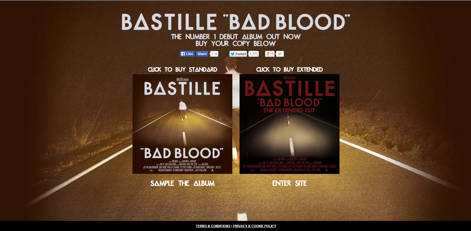
BASTILLE WEBSITE
When you enter Bastille's website before you are taken to the main space you are given the option to sample their new deluxe album and are also shown the track list and the links to buy it. You also see under there recognisable logo that they are recent winners of a brit award. This is different from other websites as the external links are usually their new videos. This is a good technique to use as it makes people fully aware of their new album before entering the real website. And the enter button is at the very bottom of the page which ensures you see what is on the page.
When you enter the website the page is full screen with changing images that are from the booklet and their logo center of the screen. The font of the different links are the same as the logo, showing consistency.
The links are clear as they are directly where the eye would go. They have also included various social media links showing that they work across many platforms to help promote themselves, for example if you click on news it redirects to facebook. Next to the links are the social media buttons. You are able to listen to their previous EPs for free, many artists do this as a way of promotion as it draws more fans in to be able to see their development in music.
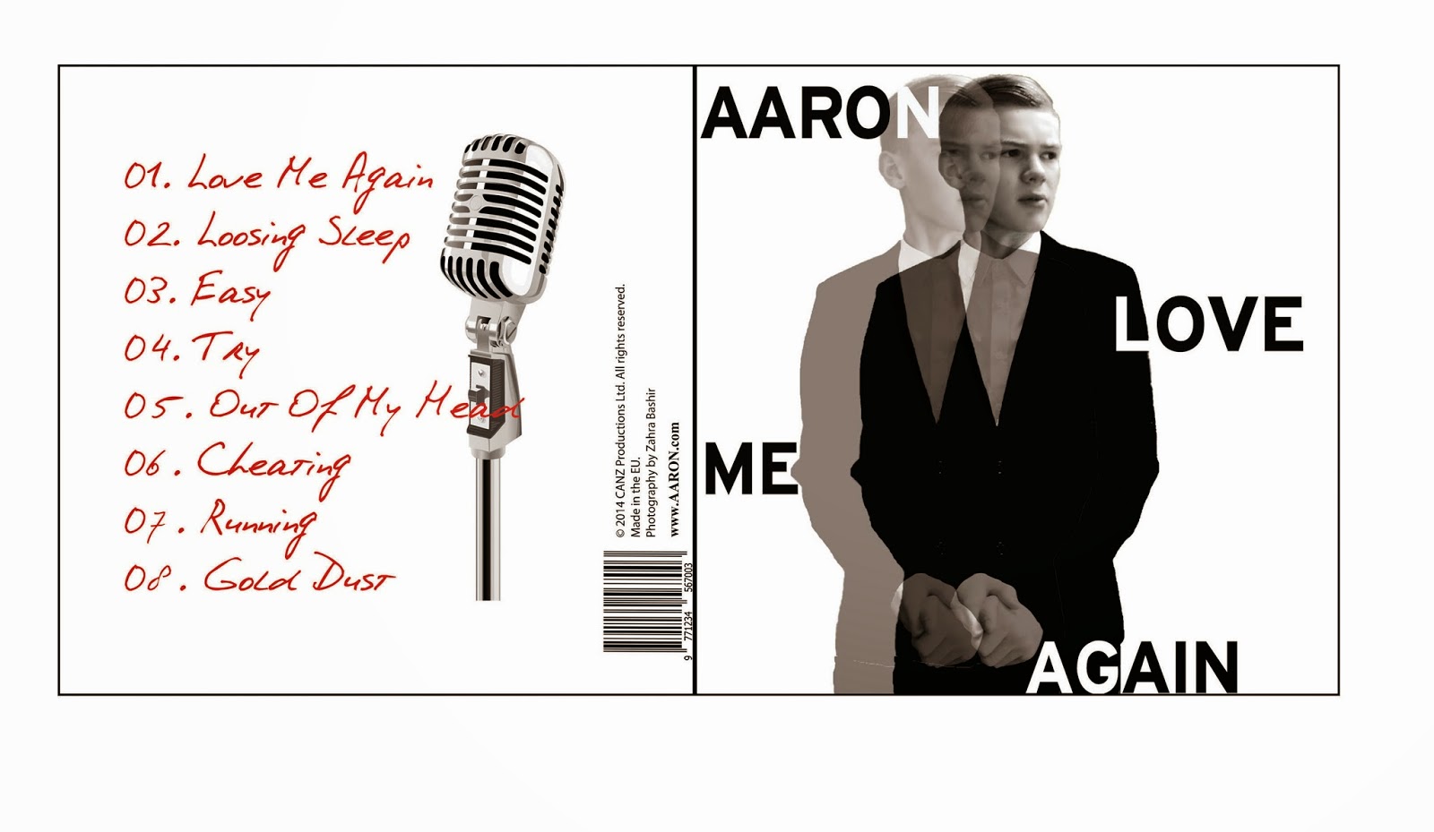
They have a link to view their album booklet which I have not seen on any other artists website before. By allowing fans to sample the album and see the digipak that comes with it will attract more fans as it suggests they care more about the music than the money.
THE 1975 WEBSITE
Again before you are able to enter the website a link comes up for you to buy their album, they have various ways you can buy the album which will attract a wider audience.
The logo of the band is the dominant item on the website, this is done so that they are identifiable. Again the tabs and links to social media are clear. The website is a tumblr which has been done due to their target audience which are teenagers, and tumblr is known as a current and modern platform. They have all the latest news eg new images, songs, remixes and tour info.
There is a reoccurring theme of black and white which is what the band is known for. This is done to create a brand identity that is identifiable and recognisable to the audience.
You are able to sign up to their mailing list to keep up to date with the latest news of the band. They have various ways in which you can follow them. Especially because it is tumblr where fans can go onto their tumblr and see the website on their feed ensuring they are always up to date with the latest.
From research of websites I know that making the artists logo visible at all times is important in creating an identity, also to keep the font the same throughout to make them recognizable. The colour should also coincide with the album cover to keep everything consistent. It is important to have more than one link to another social media site to gain more followers.